How to use color to put a polished outfit together
October 7, 2026
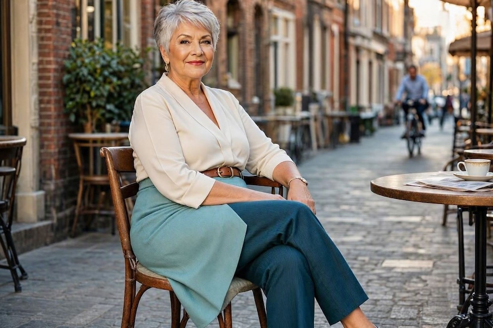
I love this look.
For some reason, fashion’s top of mind for me lately. I’m looking at my wardrobe with an eye toward upping my fashion game. And I’ve found some great online content with ideas I hadn’t considered. So today I’ll share one of them: using different hues of the same color in an outfit.
If you look at the photo above, you’ll see a good example. Two blues in different hues. And what a distinctive look! Frankly, I’d love to wear that one.
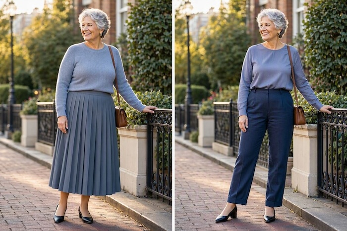
Now look below.
Photo 2
Yes, the blue-greys are different. Slightly. Not enough. But the blues on the right seem more intentional. There are other aspects to these outfits we could discuss, like the need for accessories to pull it all together, but today we’re limiting ourselves to the idea of using different shades of the same color to put an outfit together.
So let me tell you more about that technique through the photos below.
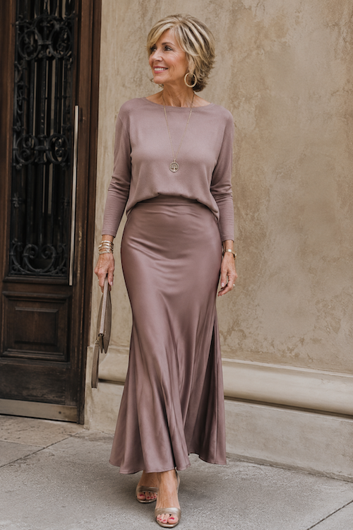
Photo 3 Too beige for me
This outfit meets the criteria: same color, different hue.
The problem is the hues are too close–it looks like she tried to match them exactly and failed. The result? Blah. A not very exciting outfit.
If I were going to use these two pieces, I’d add a colorful belt to pull it together. Or maybe a distinctive pendant. Because right now? The outfit just fades into the background.
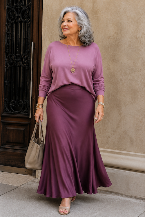
Photo 4
This duo looks more intentional. More polished. The hues are far enough apart that the outfit works. And I like the colors!
Photo 5
Love these colors, too. This pairing is ok, but the colors still feel too close. Again, we could save it with accessories, but today we’re just comparing color stories.
Photo 6
The contrast here works much better, don’t you think? The outfit looks much more intentional, far more polished.
There’s no question that these outfits are all missing accessories to pull the pieces together.
Pick an outfit. I’ve captioned them with numbers to make it easier for you to refer to one.
What would you add to make it look more intentional and polished?
This was a fascinating read. I’ve always loved color in fashion, but I’ve never devled too deeply into it. The nuances have always been a deterrent for me.
I never really thought about how much difference the distance between two shades can make until seeing these examples. The beige outfit is a good example of how two almost-matching colors can look more like a mistake than a deliberate choice!
I live in New York and so many of us wear black. From time to time, I add dashes of color or go rogue and wear a brightly colored outfit, but I love basic black, white, red, coral,orange and the occasional navy. Camel looks good on me so I wear that too.
My style is eclectic and varied; sportswear, chic mixed with street, haute couture, and afro-asian cultural leaning.
The clothes you shared looked good on the ladies, but it all comes down to taste, which is personal.
Here you’ll find my blog, some of my essays, published writing, and my solo performances. There’s also a link to my Etsy shop for healing and grief tools offered through A Healing Spirit.
I love comments, so if something resonates with you in any way, don’t hesitate to leave a comment on my blog. Thank you for stopping by–oh, and why not subscribe so you don’t miss a single post?

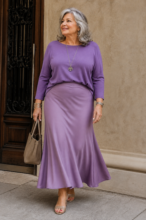
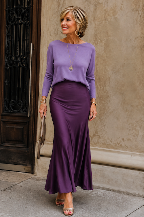

I like photo 6 ..
Currently in the UK shades of brown, burgundy, and green are in vogue for all age groups in the shops!
I’m a big fan of color, but it is so easy to go wrong with it! I love these tips. It’s going to make wardrobe styling much easier.
This was a fascinating read. I’ve always loved color in fashion, but I’ve never devled too deeply into it. The nuances have always been a deterrent for me.
I am big on color! It just makes me happier to wear them and to see color. I love all these picks.
I like color, but I have to try things on to see how they look on me. The models look great.
Yes, that is a must. This is just a way to think about color as you choose.
Wow, I love that you compared the same color, just a different tone, and the difference is huge! I’ll pay more attention when trying on clothes.
I never really thought about how much difference the distance between two shades can make until seeing these examples. The beige outfit is a good example of how two almost-matching colors can look more like a mistake than a deliberate choice!
All the pairing of colors look great. The hues are just calming to the eyes, not too sharp, just right.
I love the color tones you’ve combined in these elegant looks; they definitely elevate the style, and the gold accessories add a sophisticated touch.
I live in New York and so many of us wear black. From time to time, I add dashes of color or go rogue and wear a brightly colored outfit, but I love basic black, white, red, coral,orange and the occasional navy. Camel looks good on me so I wear that too.
My style is eclectic and varied; sportswear, chic mixed with street, haute couture, and afro-asian cultural leaning.
The clothes you shared looked good on the ladies, but it all comes down to taste, which is personal.